Vitamin Checkout Flow Redesign
Hum Nutrition
"This is a vitamin company; I'm putting this inside my body, why does the overall shopping experience online feel sketchy?"
ABOUT THIS PROJECT
HUM Nutrition offers targeted, clean nutritional solutions that are formulated with verified ingredients and backed by clinical research to help customers achieve their personal wellness goals.
This started as a personal challenge to make changes to the Hum Nutrition website when I witnessed my friend’s frustration navigating their homepage and conversion funnel shopping quiz. With the continual rise of the health-conscious trend, consumers desire a trustworthy and comprehensible flow of recommendations and information, especially when it comes to something as complex as health and wellness. I figured this was my opportunity to reimagine Hum Nutrition's conversion flow shopping quiz.
What I did
Web Design, User Experience Design, User Interface Design
THE PROBLEM
Lack of necessary User Trust and Effortlessness
I spoke with new Hum Nutrition users and avid supplement users. Both cohorts displayed an initial distrust on the homepage, with Hum Nutrition customers proceeding only because of external trust validation. Notably, the homepage and conversion funnel quiz, crucial touchpoints in their journey, suffered from issues of prominence, such as complex navigation, and interpretation problems due to misaligned content.
Thus, to enhance user experience and promote positive prominence and interpretation, we must redesign these pages to enhance clarity, aesthetics, and ultimately build stronger trust.
THE SOLUTION
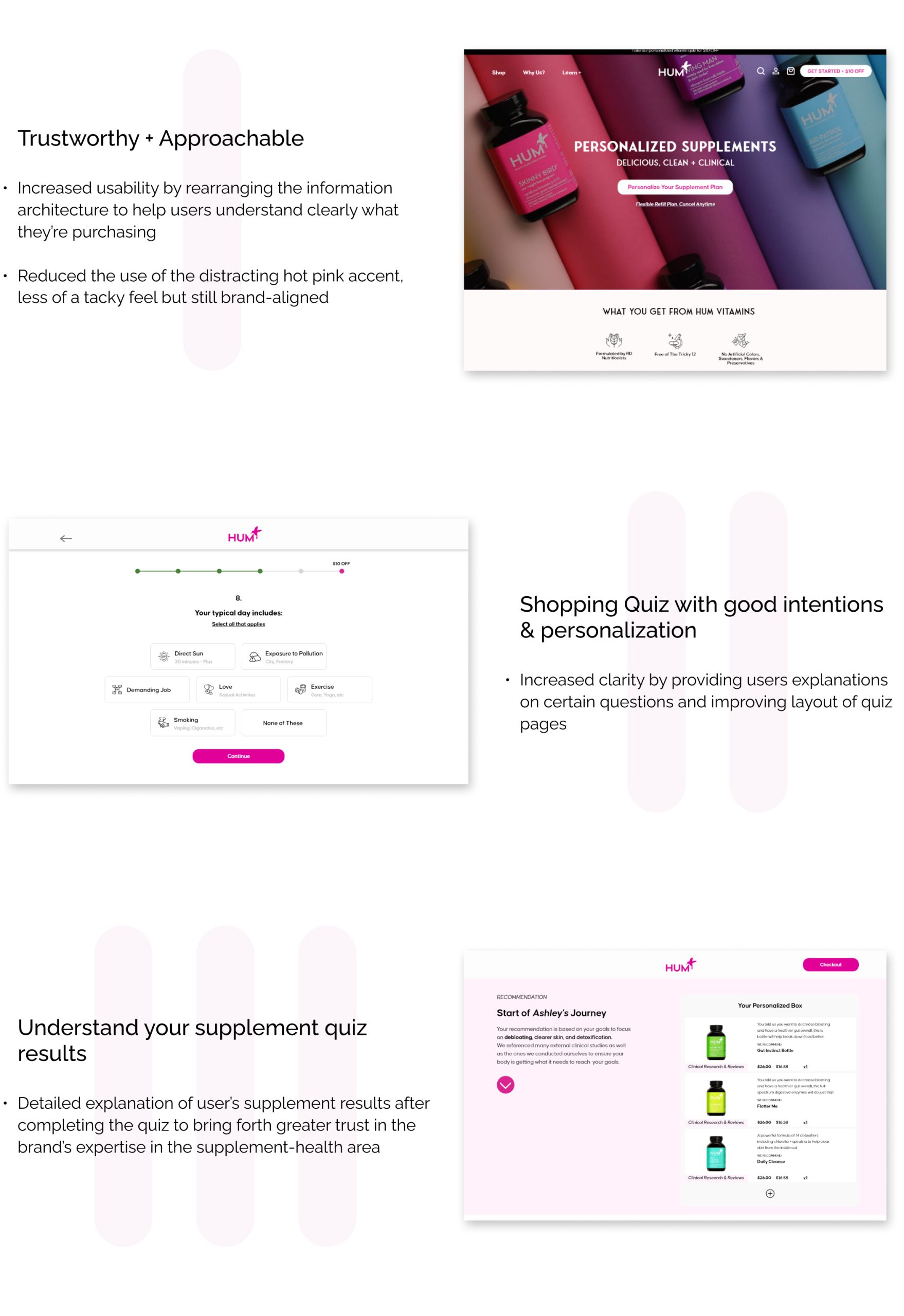
Building credibility through effective UI design
Hey there, this is the default text for a new paragraph. Feel free to edit this paragraph by double clicking on it. After you are done just click on the yellow checkmark button on the top right to save. Have Fun!
UNDERSTANDING
The Current Interface
Prior to ideation, I explored the existing interface, aiming to understand the user experience more deeply and pinpoint the problem.
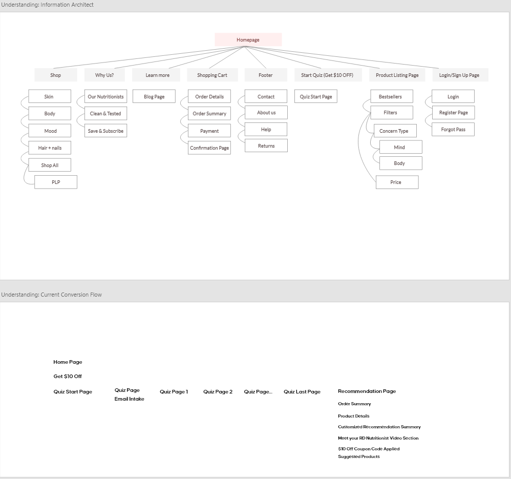
This is the overview of Hum Nutrition's site architecture and conversion flow.
User Goals
The user's objective is to acquire personalized supplement recommendations from the shopping quiz and proceed to checkout. In order to reach this stage, the user must first navigate through a series of vital tasks:
- Browse the landing page to learn about product function, variety, and subscription plan
- Take the supplement quiz to receive personalized recommendations based on body goals
- Navigate to the recommendation page and review the accuracy of the products recommended
- Proceed to checkout and purchase the recommended products
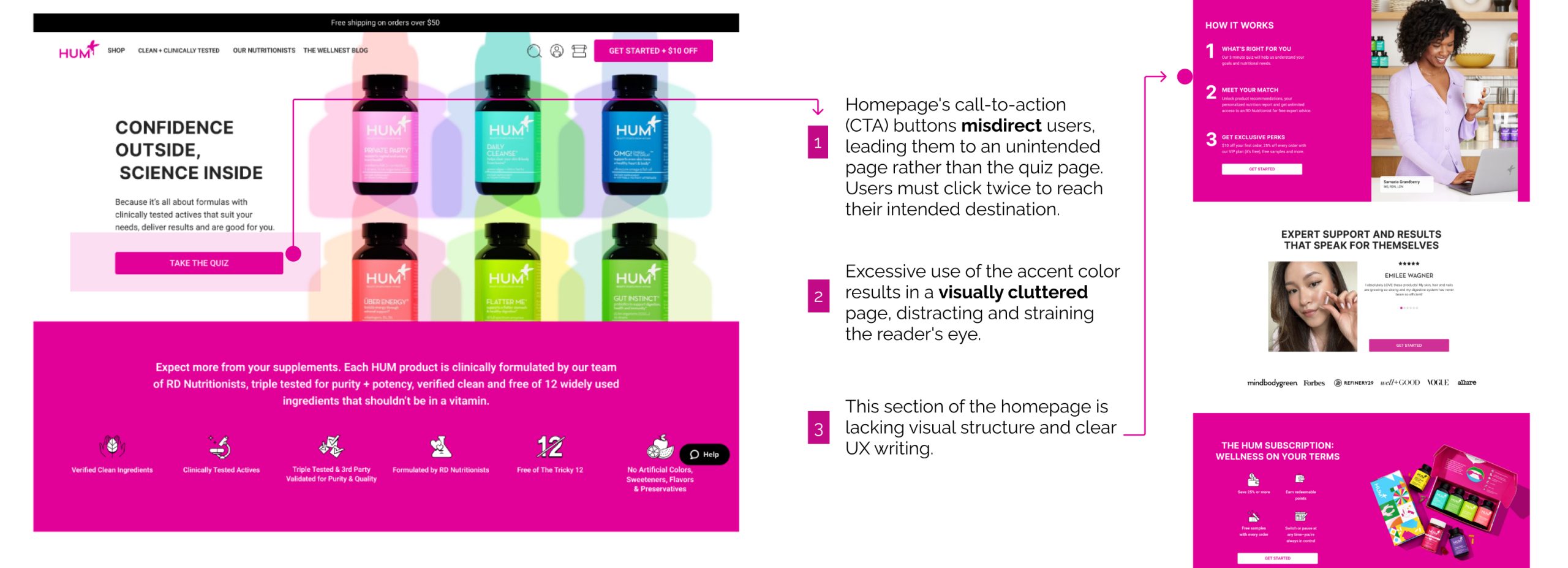
Current Homepage
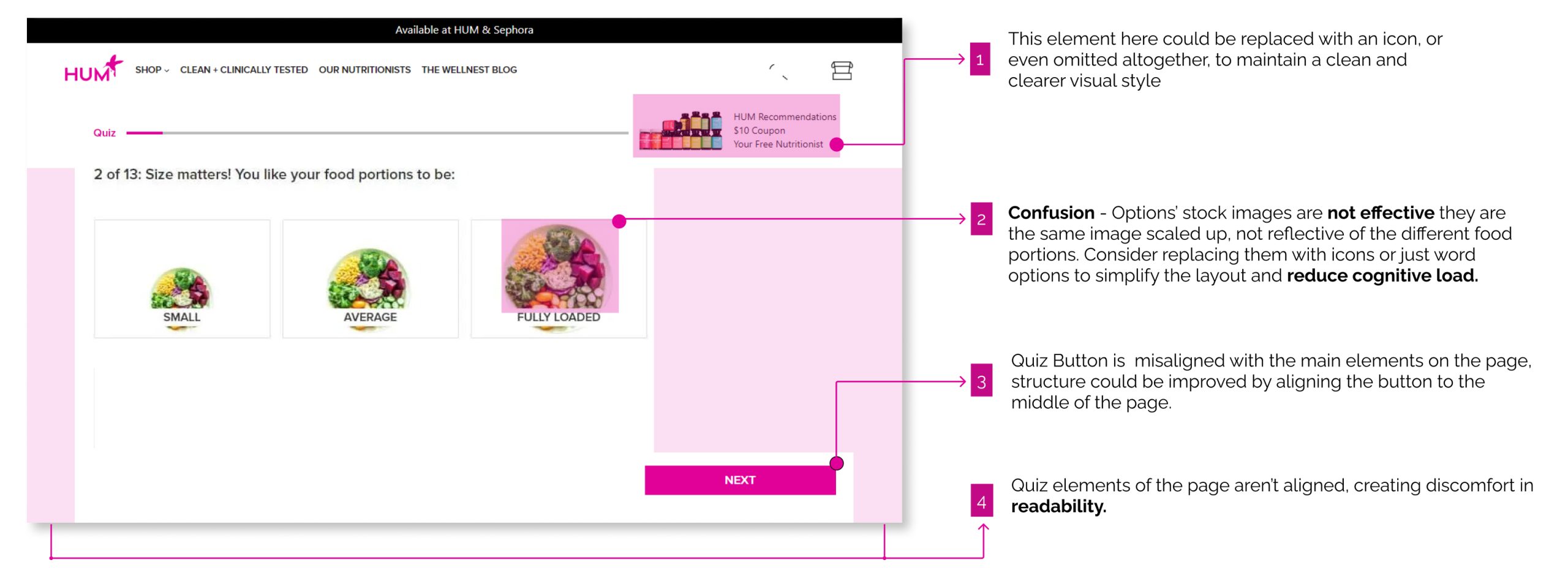
Current Quizflow
Desktop Version
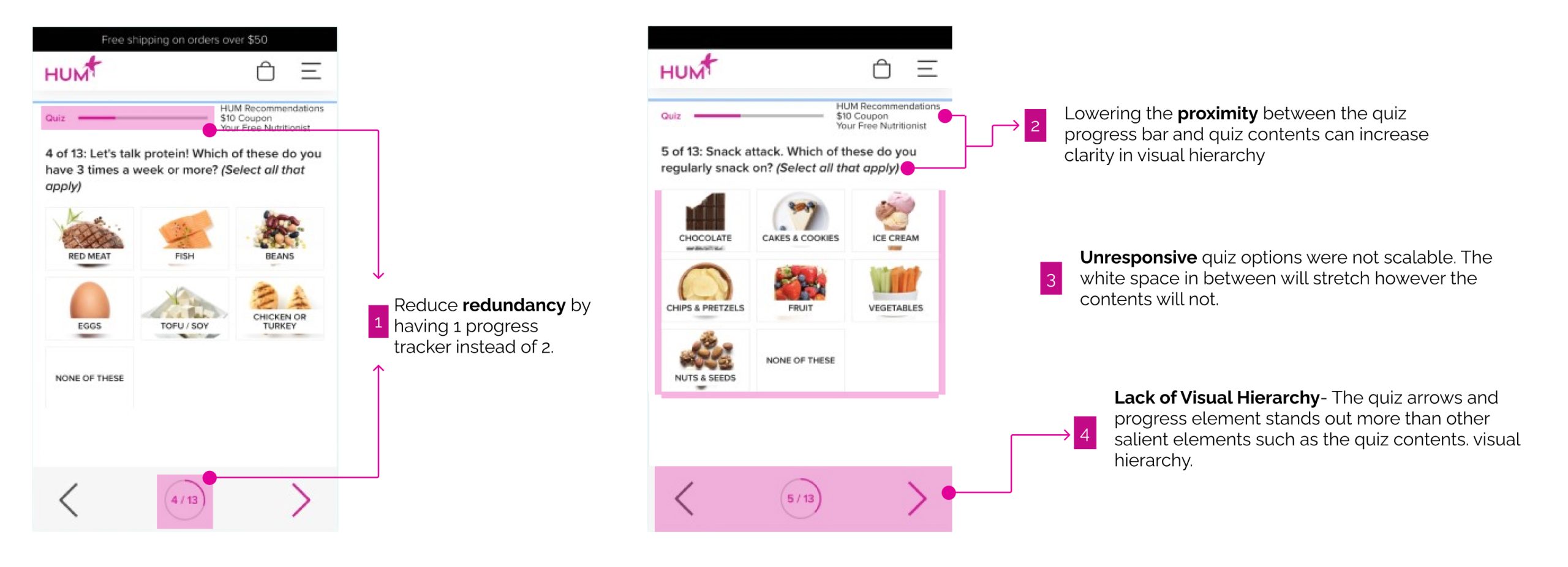
Mobile Version
Current Recommendation Page
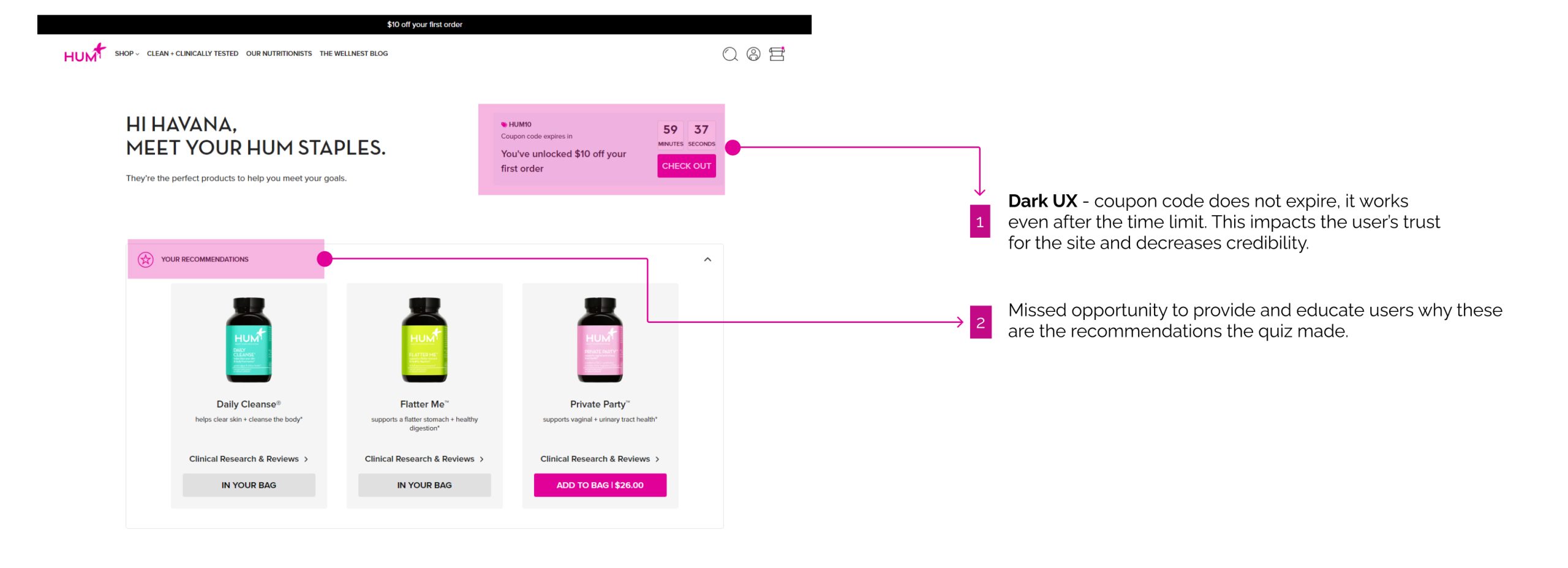
Desktop Version
How might we help curious supplement users navigate through the conversion funnel quiz flow whilst ensuring an understanding and trust of Hum Nutrition's products?
Design Principles
Ease and Consistency
Consistency in designs helps users understand the function of the design quicker cognitively which in turn will help them navigate the pages with ease.
Keep it Comprehensive
Especially for products affecting the human body, it is important to be clear when communicating information on how tis will impact users' well-being.
Integrity Driven Conversion
Avoid dark UX designs, present pages in an honest manner.
USER RESEARCH
Interviewees valued the feelings of trust in designs
Although the initial project inspiration came from a few of my friend’s frustration who were referred to Hum Nutrition’s products by bloggers, I wanted to see if their hesitancy with the company’s e-commerce website was consistent with supplement consumers who never encountered it before. I conducted interviews with 5 avid supplement takers and asked them the questions below to find out what was at the core of their bad experience in order to improve it.
RESEARCH QUESTIONS:
- Tell me about the last experience you had when shopping for supplements, what was it like?
- Walk me through your process when you’re assessing a store’s supplement products?
- What feeling(s) did you get upon landing on the homepage?
- How did you find that experience after finishing the quiz?
- What are some of the features you liked or didn’t like when you got to the recommendation page?
Interview Snippets:
Below are audio clippings from my 2 user interviews, both kindly consented to me using their recorded clips for this project. Listen in to gain a better understanding of their emotions and experience as they navigated through Hum Nutrition's current website.
"
...using icons or images that actually pertain to the category names would make more sense.
"
"
...it is just all being taken away by this blaring pink color that is all over the site.
"
Research Insights
- Confusion due to excessive use of the pink accent color
- A disconnect between images and labels
- A lack of trust in the recommendation page
- Confusion with navigation and relevance of quiz questions
Pain Points derived:
- Ineffective visual hierarchies present on the Homepage
- Unclear quiz flow and quiz content relevancy
- Lack of personalization on the Recommendation page
IDEATION
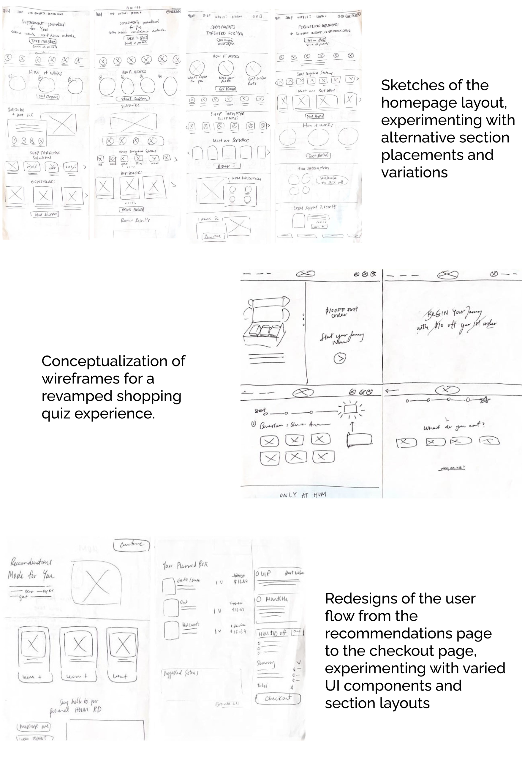
Ideating through Sketch
Armed with ideas, I turned to the timeless pen and paper method to translate thoughts into tangible sketches.
Prioritizing simplicity and consistency in my UI design sketches, I avoided elements that might breed user distrust. For inspiration, I looked to companies like HelloFresh, Care/Of, Scentbird, Aduible, and Vous Vitamin, all shining in the subscription sphere and/or excelling in conversion UXUI design.
- Browse the landing page to learn about product function, variety, and subscription plan
- Take the supplement quiz to receive personalized recommendations based on body goals
- Navigate to the recommendation page and review the accuracy of the products recommended
- Proceed to checkout and purchase the recommended products
THE DESIGN SOLUTION
Final Designs
Through multiple iterations, user feedback, and valuable insights from mentor Brian, I was able to deliver refined mobile and desktop designs for Hum Nutrition's Homepage, Shopping Quiz Flow and Recommendation Page.
Major Changes within the Homepage
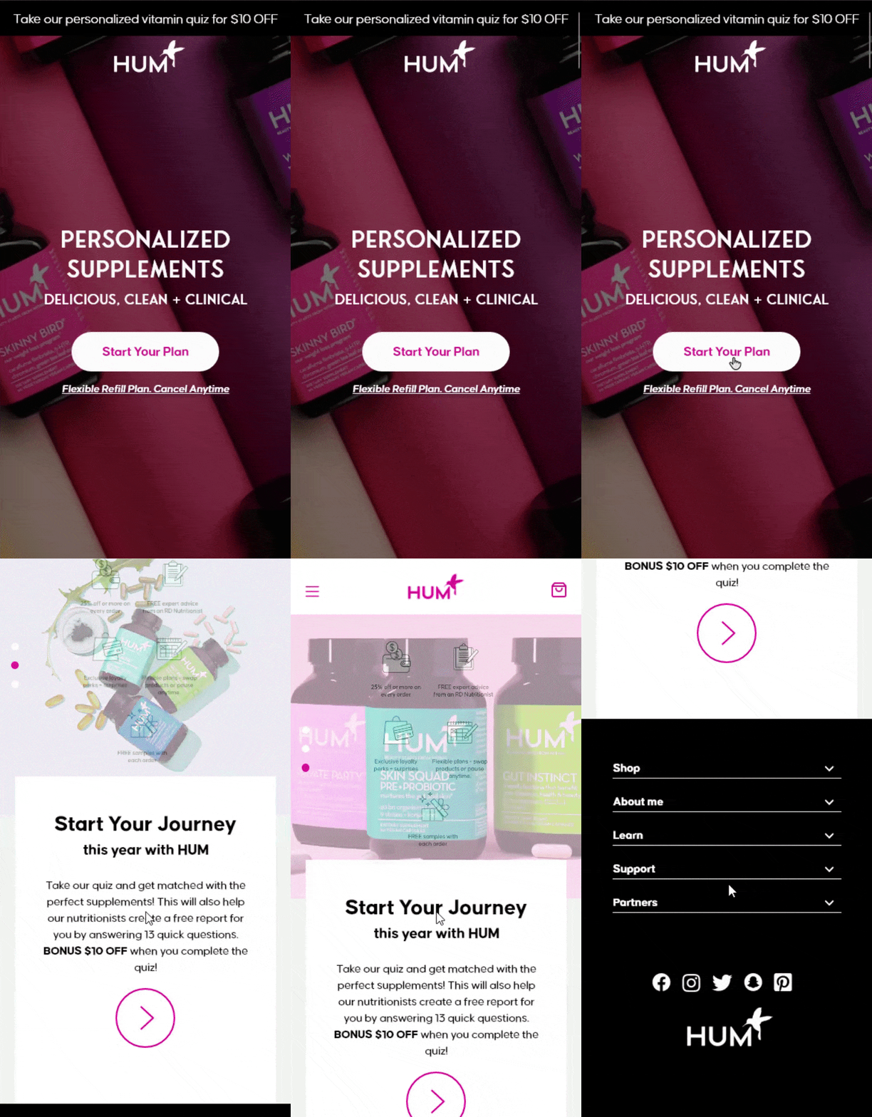
Centered Elements: Instead of a left aligned hero banner, I chose to use an image with no prominent justification and centered the related components. The centered justification of components conveys a more balanced visual hierarchy compared to the original design.
Accessible Carousel: To enhance accessibility, I added Floating Action Buttons (FAB) which appear upon user's mouse hover, enabling carousel image rotation. Dashed indicators were also introduced to signify the carousel's position. These changes address cognitive overload from previous designs, boosting function clarity.
Reduction for Simplicity: The original design's extensive use of pink and verbose sections led to user frustration. In my redesign, I limited the pink palette and restructured both the text and components, such as the 'How It Works' section, to enhance user comprehension.
Recommendation Page that Acutally Informs
The first thing I addressed was the lack of summarization pain point users had with the original recommendations page. To mimic the analysis a professional nutritionist might give, I made sure key elements were clearly visible upon arrival and included a concise summary reflecting their quiz results.
I also eliminated the 'Coupon Countdown Timer', a dark UX element that created artificial urgency by imposing a faux expiration time. Removing this deceptive component fosters a more authentic experience for users shopping on this site.
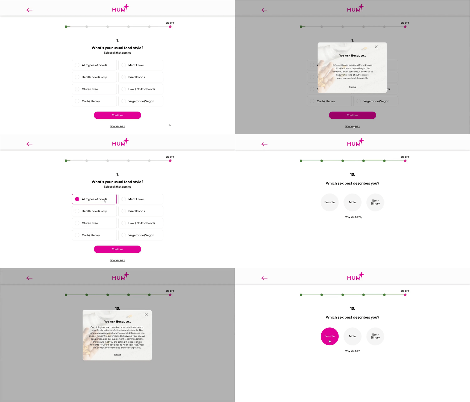
Using Modal Overlays Effectively
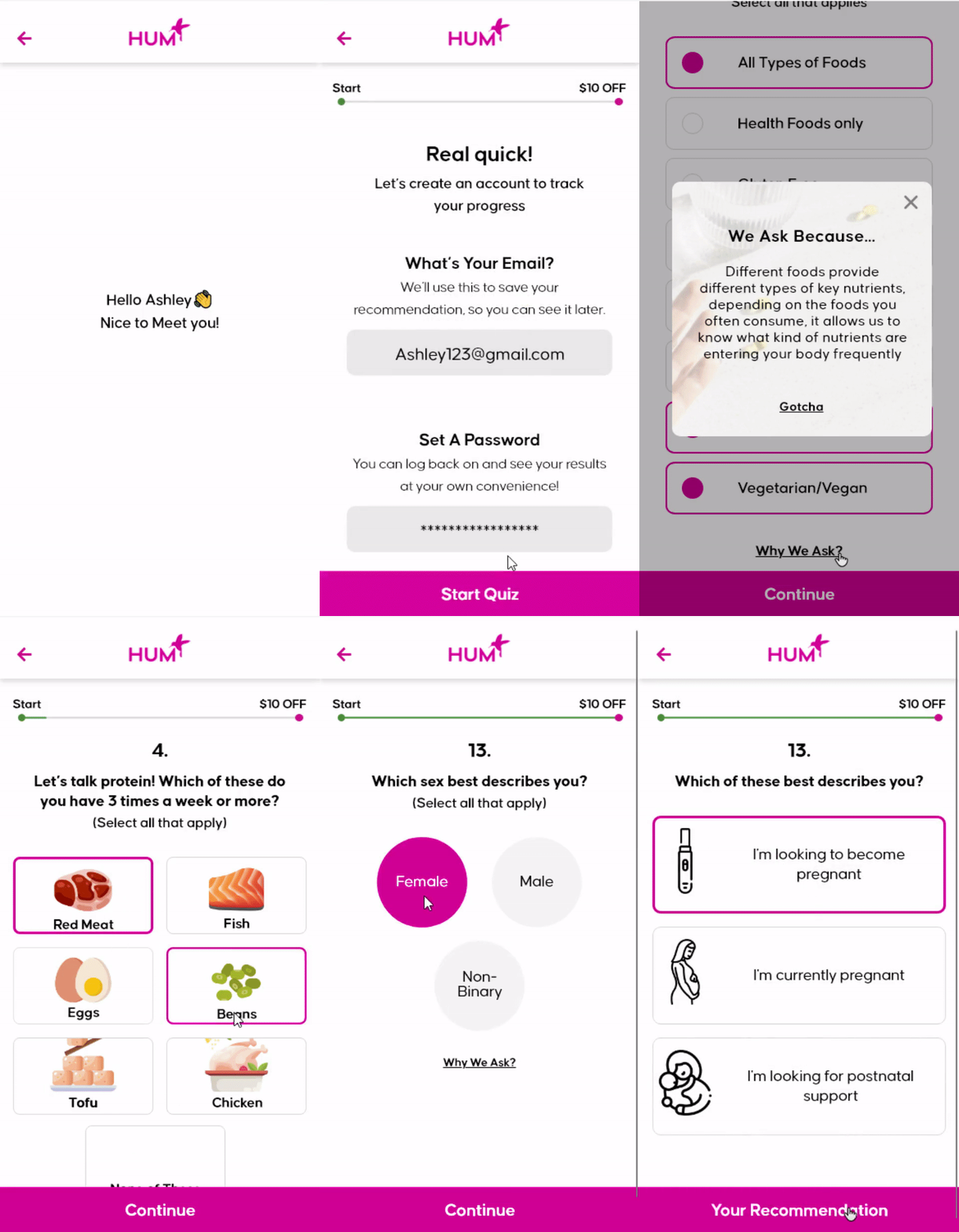
User feedback indicated confusion over some questions and a desire for more context. To address this, I introduced a "Why we Ask" modal button for certain potentially sensitive or complex questions. Upon clicking, users can understand the reasoning behind each question, fostering trust and showcasing the company's expertise in health knowledge. This feature acts as a clarifier, enhancing user understanding and confidence in the quiz's purpose.
Iconography on Cognitive Load
From user interviews, I learned the quiz induced cognitive overload. To alleviate the confusion and ambiguity of the original design, I strategically implemented a balance of icon usage. For some questions, I paired icons that was better matched with text labels to enhance recognition, while for others, I opted for icon removal to mitigate cognitive load.
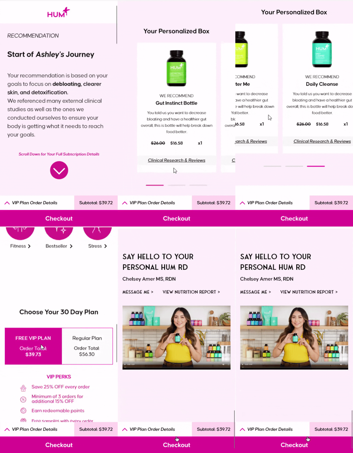
Recommendations Page
While designing this content-rich mobile page, I considered the potential for information overload. Understanding this challenge, I organized the layout to progressively unveil content, allowing users to focus on manageable sections at a time. I implemented a fixed checkout button to aid quick browsing and added an expandable, collapsible order detail element for user flexibility
Contextual Information Page
To heighten clarity and improve user experience in the quiz journey, I incorporated a contextual information page. The original quiz flow directed users to a page more focused on selling than orienting them within the process. This absence of context left users feeling disoriented and overwhelmed. By aligning with key UX principles, particularly 'being clear' and 'being simple', this change now guides users smoothly along their journey, ensuring they remain informed about their progress and what to expect next.
Mobile Visibility
The original mobile quiz was scaled down version of the desktop quiz, which is not an optimized design for mobile visibility and interactivity. To mediate this issue, I made the buttons larger for better touch accessibility.
Designing within Boundaries: Embracing Constraints
Personal projects can easily lose focus without defined constraints.
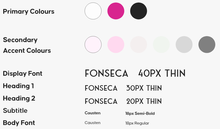
In this endeavour, I set constraints like retaining Hum Nutrition's brand colours and content, albeit reshaped as needed based on user insights. I also added lighter shades to their style guide. This helped tone down their bright pink brand colour, and introduced a calming, trustworthy sentiment - something we often associate with the health industry. The idea was to use colour to subtly foster a sense of balance and reliability for users.
Key takeaways
Constraints, Feedback, and Integrity Through Design
Tackling Perfection with Constraints:
One of the major lessons from this project has been learning to view constraints not as obstacles, but as opportunities for creative problem-solving. The constraints I placed on myself - strict deadlines, clear objectives - were what ultimately allowed me to break free from the loop of endless iteration. They forced me to make decisions and move forward, turning what could have been a roadblock into a powerful catalyst for progress.
The Power of Feedback and Iterative Learning:
Feedback and iteration emerged as vital components of my design journey. Acknowledging critique, revising designs, and viewing each step as a learning opportunity rather than failure has immensely contributed to my growth as a designer and the success of the project.
Integrity CAN be shown through design:
In synthesizing user interview insights, I discovered that integrity can indeed shine through design. When users interact with a well-crafted product, they may not explicitly recognize the amount of work put into it, but they intuitively appreciate the quality. This appreciation, although often subconscious, is a silent nod to the effort invested and the integrity of the design process
If I had more time: I'd definitely create my own icons to reflect the quiz question option labels better and explore other flows of the website.